2024

Background
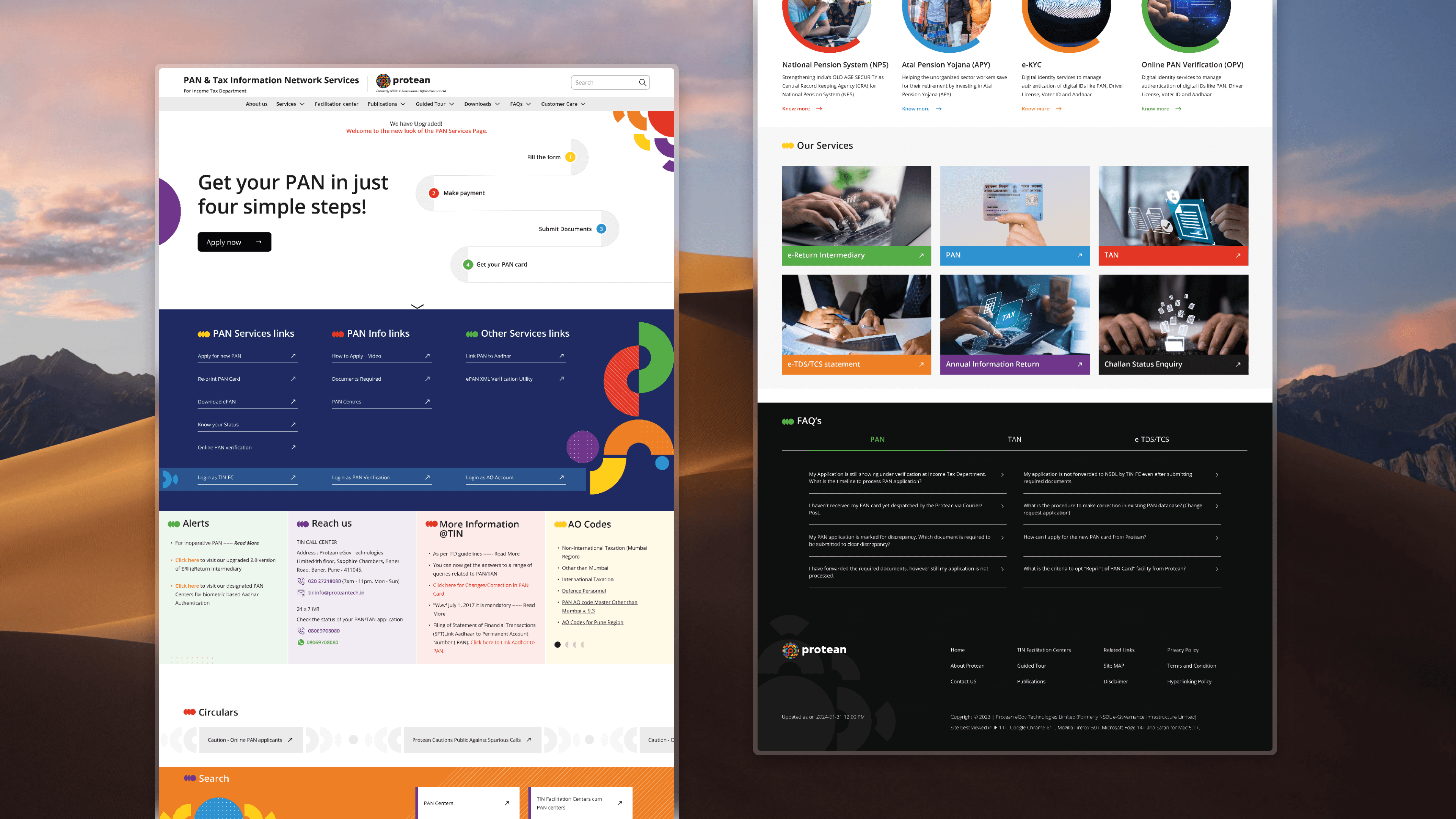
The Protean PAN website serves over 1.6 million daily users seeking tax and PAN-related services. The previous website faced critical usability issues, such as content overload, poor navigation, and an outdated design. Our redesign aimed to transform this platform into a user-friendly, accessible, and efficient service hub.
Core problem
The platform faced several challenges:
Content Heavy: Overwhelming text made finding key information difficult.
Unorganized Structure: Confusing navigation and unsorted content led to frustration.
Outdated Design: The site didn’t align with Protean’s brand guidelines and lacked modern design principles.
Accessibility Barriers: Limited accessibility hindered usability for all users.
Goal
Redesign the Protean PAN website to improve user experience, simplify navigation, and ensure accessibility, aligning with Protean’s brand and usability standards.
Approach & Process
Content Simplification:
Conducted a full content audit to remove redundancies, retaining only essential and user-friendly information. Enhanced search functionality with predictive text and filters for quick results.
Information Architecture:
Reorganized the site with hierarchical menus and categorized content for intuitive navigation. Designed clear CTAs to guide users effectively.
Wireframing & Prototyping:
Developed low-fidelity wireframes to test and iterate on the user flow, ensuring logical content structure.
Visual Design:
Implemented a modern and professional aesthetic consistent with Protean’s branding, with responsive layouts optimized for mobile devices.
User Testing:
Iterative testing sessions helped validate design decisions and refine features based on user feedback.
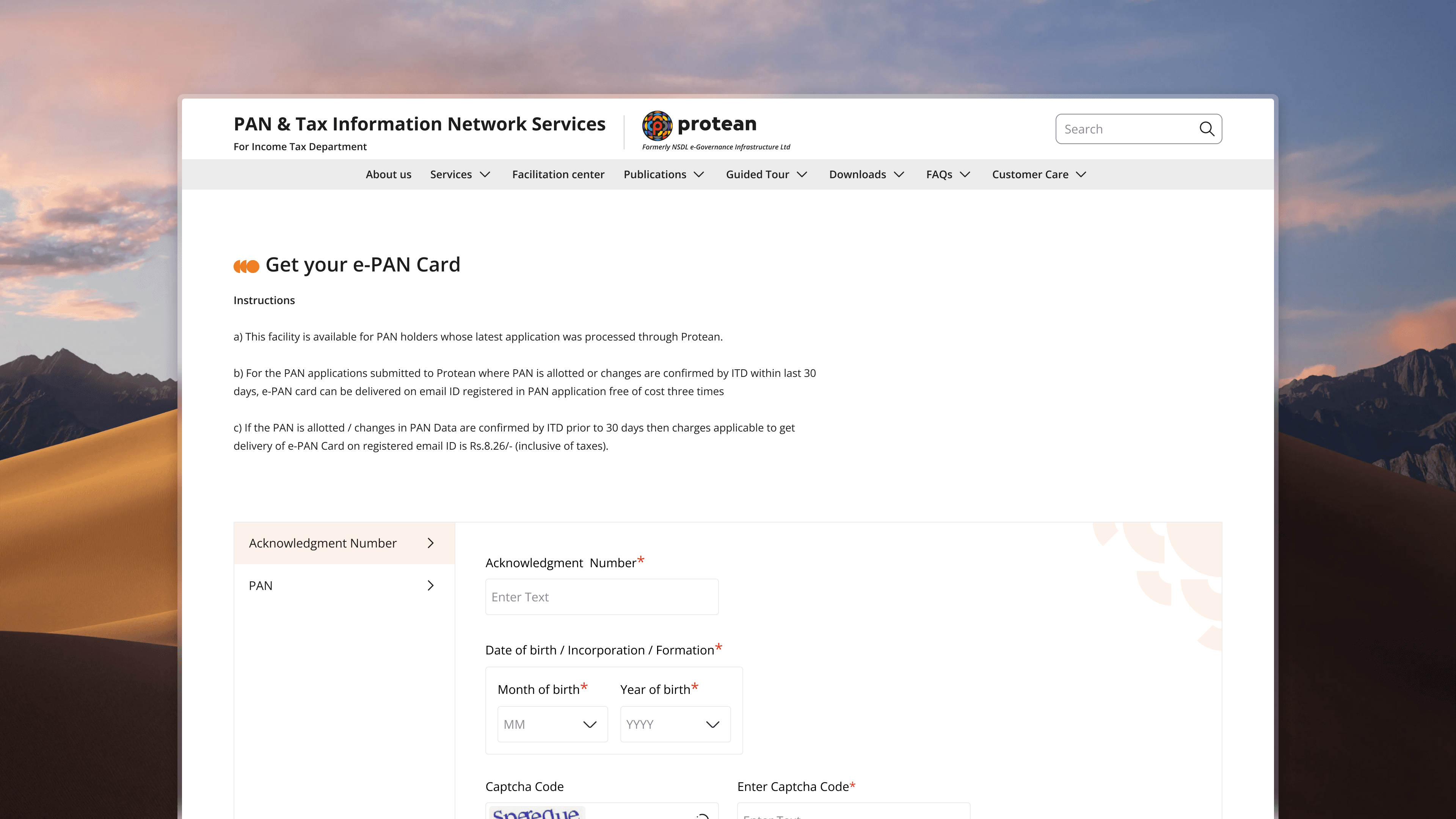
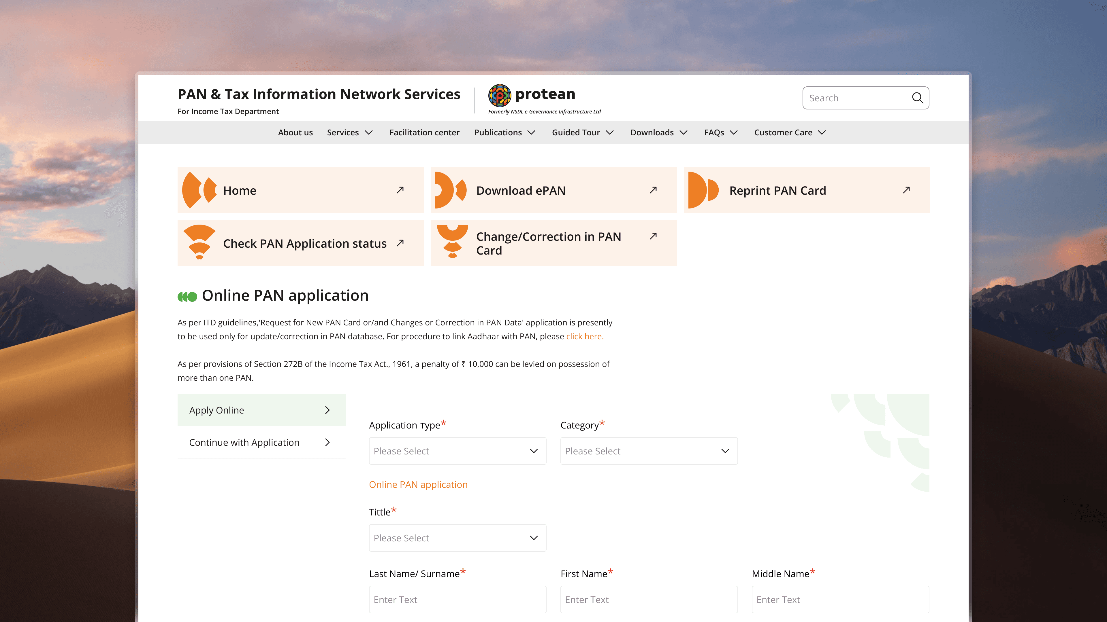
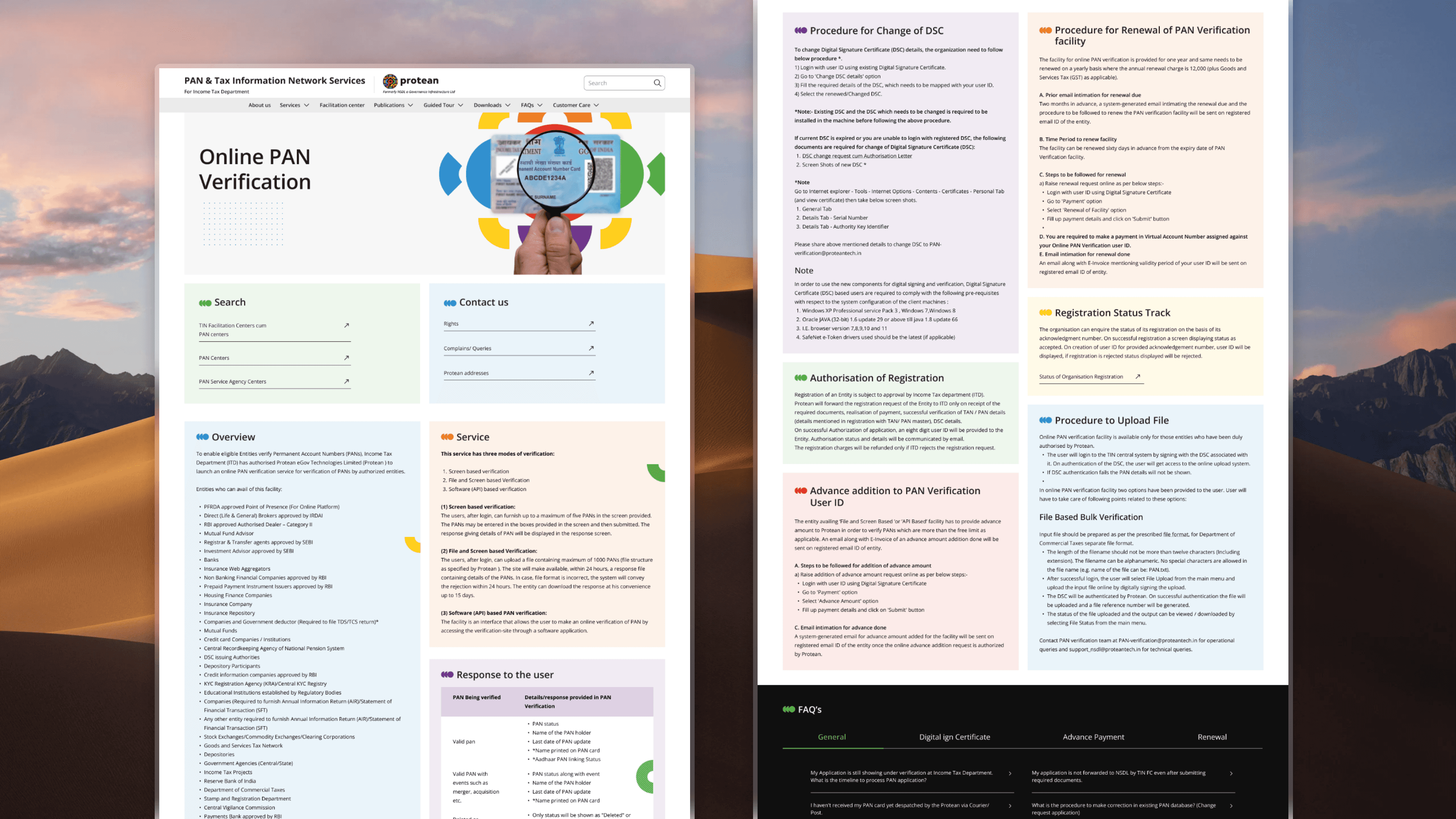
Solution
The redesigned website features:
Simplified Navigation:
An intuitive menu with sticky navigation and clear categories for effortless access.
Clear Content Hierarchy:
Prioritized key sections like PAN services and tax resources with visual differentiation and white space.
User-Friendly Forms:
Progressive disclosure for complex forms and optimized layouts to reduce errors.
Enhanced Accessibility:
WCAG-compliant design with clear navigation and screen reader compatibility.
Interactive Help Center:
Expanded FAQs, live chat support, and troubleshooting guides.
Responsive Design:
Seamless experience across devices with touch-friendly elements and faster load times.
Results:
Improved Usability: Reduced bounce rates and enhanced user satisfaction through clear navigation and streamlined content.
Higher Engagement: Increased form submissions and time spent on the site by 25%.
Accessibility Success: Positive feedback from users with disabilities on improved usability and inclusivity.